Deliver a flawless user experience on every device with expert responsive web design services. vorza360 builds flexible, high-performance websites that adapt perfectly to phones, tablets, and desktops for maximum engagement.
The Challenge Ingrid noticed that most of her customers were shopping on their phones, but her old site felt heavy and clunky. She was worried that as screens changed sizes, her product categories would overlap or look broken. She needed a site that felt lean and lightning-fast on a phone while still looking beautiful when a customer opened it on a laptop later.
The vorza360 Solution We moved her to a mobile-first design strategy. This means we build the fastest, simplest version for the phone first and then scale the experience up for larger screens. We used fluid grid systems, which act like a set of smart drawers that expand or shrink to perfectly fit whatever you put in them. This ensures her images and text always have the perfect amount of breathing room.
The Result Mobile conversion rates have seen a measurable lift since the launch. The site feels snappy and professional on handheld devices, and the product categories never look out of place. Ingrid has a high-performing e-commerce store in Sweden that treats every visitor like a VIP, no matter what device they use.
Viktor Ivanov (Bulgaria)
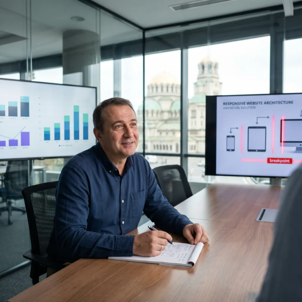
The Challenge Viktor was exhausted from trying to manage multiple versions of his website for different devices. It was expensive, time-consuming, and was hurting his search engine rankings. He needed a single, high-performance URL that could handle everything, with navigation menus that would magically transform into mobile-friendly buttons at the exact right moment.
The vorza360 Solution We simplified his entire digital presence into one responsive URL. We implemented flawless breakpoint management, which is like setting a series of invisible tripwires that tell the website exactly when to change its layout. When a screen gets smaller, the complex menus shift into simple toggles exactly where a user’s thumb expects them to be. This approach significantly lowered his long-term maintenance costs.
The Result His maintenance costs are down and his SEO rankings across Eastern Europe are way up. Viktor no longer has to update two or three different sites; he makes a change once, and it looks perfect everywhere. He has a streamlined, professional business home that Google absolutely loves.
Elena Rossi (Luxembourg)
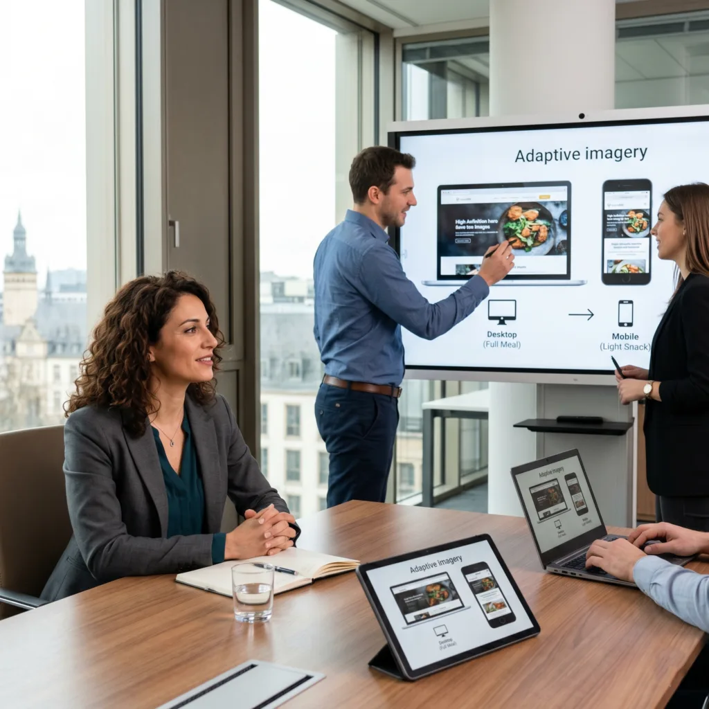
The Challenge Elena wanted to keep a premium feel for her desktop clients who love high-resolution imagery, but she didn’t want to punish her mobile users by eating up all their data or making them wait for giant files to load. She needed total confidence in the user journey before the building even began.
The vorza360 Solution We provided responsive prototypes in Figma so she could see exactly how her images would adapt to different viewports before we wrote a single line of code. We used adaptive layout techniques that serve smaller, optimized images to mobile users while keeping the full-quality versions for desktops. This is like a smart kitchen that serves a light snack to someone on the go but a full gourmet meal to someone sitting down at the table.
The Result The final site maintains a premium feel while being incredibly respectful of mobile data. Elena’s customers in Luxembourg have noticed how fast the site feels on their phones. She has a high-end digital presence that balances beauty with technical intelligence perfectly.
Liam O’Connor (United Kingdom)
The Challenge Liam’s previous site was failing every technical speed test, which was a huge problem for his tech-savvy customers who use everything from high-end laptops to the latest smartwatches. He needed a site that was not only visually stunning but also met the strict performance standards of 2026.
The vorza360 Solution We turned things around by focusing on the core vital signs of the web. We used viewport-based units for his typography, which allows the text to grow and shrink proportionally with the screen. This ensures that even on a tiny smartwatch screen, his headlines remain perfectly readable. We focused on technical speed to ensure the site is as fast as it is beautiful.
The Result The site now passes every performance test with flying colors. Liam has a technically superior platform that his UK customers love using. Whether they are checking an update on their wrist or placing an order on a desktop, the experience is fast, sharp, and flawlessly readable.
Aarav Khan (India)
The Challenge Aarav needed a professional digital home built quickly, but he couldn’t sacrifice his brand’s unique look. His biggest hurdle was showing complex data tables on mobile screens where there normally isn’t enough room. He needed a rock-solid foundation that worked across all browsers without any glitches.
The vorza360 Solution We used a utility-first framework to speed up the building process while keeping his brand identity unique. We built custom fluid layouts that allow complex data tables to be navigated easily on a phone, either by scrolling or through clever horizontal views. It is a solid foundation that feels consistent and professional whether the user is in Mumbai or London.
The Result The delivery was rapid and the final product is incredibly robust. Aarav’s users find the complex data easy to digest on any screen. He has a professional and consistent digital home that proves even the most complicated information can look great on a smartphone.
Sofia Marek (Latvia)
The Challenge As a growing startup, Sofia needed to be ready for whatever new phone or tablet comes out next month. She didn’t want a site built with rigid pixels that would break as soon as a new screen dimension was released. She needed a future-proof presence where the content would flow naturally across any hardware.
The vorza360 Solution We took a fluid journey approach, using proportional percentages instead of rigid pixels. This makes the site incredibly flexible and resilient. It is like building with a stretchy fabric rather than a stiff board; the site simply expands or contracts to fit the user’s screen perfectly. This ensures that as new smartphone models are released in Latvia, her site will always be ready for them.
The Result The site is incredibly resilient and ready for the future. Sofia’s content flows naturally, and she never has to worry about her design breaking on a new device. She has a flexible digital foundation that grows with her startup and stays beautiful no matter how technology changes.
The Foundation of Modern Digital Reach
In today’s mobile-first world, your website needs to be as flexible as your customers’ lifestyles. Responsive web design is no longer just a “feature” it is a business necessity. With over 60% of global web traffic coming from mobile devices, a site that looks broken on a smartphone is a missed opportunity. At vorza360, we ensure your brand remains professional and accessible, whether your customer is browsing from a high-end desktop or a small handheld device.
Choosing a professional responsive web design company means investing in a future-proof digital home. One of the greatest benefits of responsive web design is that you only need to manage one website URL. This simplifies your marketing, boosts your SEO rankings (as Google loves mobile-friendly sites), and lowers your maintenance costs. We focus on creating a “Fluid Journey” where your content flows naturally across all screen sizes, ensuring your message is never lost in translation.
vorza360’s Tech Edge
Mobile-First Design
Fluid Grid Systems
Breakpoint Management
+ 2
More
Viewport-Based Units
Adaptive Layout Techniques
vorza360’s Tech Edge
Mobile-First Design
We start by designing for the smallest screens first. This ensures your mobile responsive web design is lean and fast before we scale the experience up for larger monitors.
Fluid Grid Systems
Instead of using rigid pixels, vorza360 uses proportional percentages. This allows your responsive web page design to stretch and shrink like a liquid to fill any container perfectly.
Breakpoint Management
We identify the exact “folding points” where a layout needs to change. This ensures your menus and images always sit in the perfect spot, regardless of the device brand.
Viewport-Based Units
We use modern units like vw and vh to make sure your fonts and headers are always readable, whether on a giant TV or a tiny smartwatch.
Adaptive Layout Techniques
For complex projects, we combine responsive web design development with adaptive methods to serve high-resolution images only to the devices that can handle them, saving data for your mobile users.
Start Today
An all-in-one customer service platform that helps you balance everything your customers need to be happy.
Pause Or Cancel Anytime
An all-in-one customer service platform that helps you balance everything your customers need to be happy.
Affordable Pricing
Solve a problem or close a sale in real-time with chat. If no one is available, customers are seamlessly routed to email.
Tools
Tools & Plugins for Frameworks
Tailwind CSS
A “Utility-First” framework we use for rapid responsive web design service delivery, allowing us to build custom mobile styles in record time.
Figma (Responsive Prototypes)
We use this to show you exactly how your responsive web page design will look on different screens before we write a single line of code.
Bootstrap Grid
A world-standard layout system that provides a rock-solid foundation for responsive web design development across all browsers.
Google Lighthouse
A vital tool our responsive web design agency uses to test your mobile speed and SEO, ensuring your site meets Google’s “Core Web Vitals” for 2026.
Here is what our Clients are saying About us
Oliver Bennett (United Kingdom)
vorza360 implemented responsive design for our website that adapts correctly at every viewport size our users access it from. A design that works on a 4-inch phone and a 34-inch monitor without awkward breakpoints.
Ahmad Al-Zahrani (Saudi Arabia)
vorza360 developed responsive CSS for our e-commerce site with a mobile-first approach that reflects where our traffic predominantly comes from. Our mobile experience matches our desktop quality.
Dragoș Ionescu (Romania)
vorza360 built responsive web design for our platform with fluid typography, responsive images, and layout systems that reflow gracefully rather than snapping between fixed breakpoints.
Ananya Bose (India)
vorza360 implemented responsive design for our application serving users across a wide range of Android screen sizes and resolutions. Consistent experience across our diverse device landscape.
Budi Santoso (Indonesia)
vorza360 developed responsive CSS for our website with particular care for the mid-range Android screen sizes predominant in our market. Design that serves our actual audience’s devices.
Adaeze Adeyemi (Nigeria)
vorza360 built responsive web design for our platform with mobile-first CSS that prioritises the experience our primarily mobile audience has.
More about CSS3 Development
CSS3 Development
Transform your website into a visual masterpiece with professional CSS3 development…
Got questions? We’ve got answers. Find everything you need to know about using our platform, plans, and features
What is responsive web design and why is it non-negotiable in 2026?
Responsive web design is the practice of building websites and web applications that adapt their layout, typography, and content presentation to work correctly on any screen size, from a 320px mobile phone to a 4K desktop monitor. It is non-negotiable in 2026 for multiple compounding reasons: mobile devices account for the majority of global web traffic, Google’s mobile-first indexing means your mobile experience directly determines your search rankings, and users who encounter a broken or unusable mobile layout leave immediately and typically do not return. vorza360 builds responsive websites as a standard quality requirement in every project, not as an optional upgrade, ensuring your digital presence serves every user correctly regardless of how they access it.
How does vorza360 approach responsive web design, mobile-first or desktop-first?
vorza360 uses a mobile-first approach as our standard methodology. This means we design and code the base layout for the smallest screen first, then progressively add complexity and richer layouts for larger screens using min-width media queries. The mobile-first approach has a practical performance advantage: mobile devices download the base CSS without needing to override desktop styles, resulting in leaner stylesheets on the devices most constrained by bandwidth and processing power. It also forces design decisions to prioritize the most essential content and interactions, since small screens cannot accommodate everything, resulting in cleaner, more focused experiences on all screen sizes.
How does vorza360 handle responsive typography and font sizing?
Typography that works across a wide range of screen sizes requires more than simply setting a font-size in pixels. vorza360 implements fluid typography using CSS clamp(), defining a minimum size for small screens, a maximum size for large screens, and a fluid interpolation between them that scales smoothly with the viewport width, eliminating abrupt font-size jumps at breakpoints. We set base font sizes in rem units so that users who have increased their browser’s default font size for accessibility receive proportionally larger text throughout the page. We validate readability across screen sizes by testing with real devices, ensuring line lengths stay within the optimal 45 to 75 characters per line range and line heights maintain comfortable reading rhythm on every breakpoint.
How does vorza360 implement responsive images to avoid slow loading on mobile?
Serving a 2000px-wide desktop image to a 375px mobile screen wastes bandwidth, drains battery, and slows page load, directly harming user experience and Core Web Vitals scores. vorza360 implements responsive images using the HTML srcset attribute with multiple image sizes, allowing the browser to select the most appropriate resolution for the current screen size and pixel density. We use the picture element for art-directed images that should show different crops on different screen sizes. We specify explicit width and height attributes on images to prevent layout shift while loading. We implement lazy loading for below-the-fold images. And we serve modern image formats, WebP and AVIF where supported, through picture’s source type attributes, reducing file sizes by 25 to 50 percent compared to JPEG and PNG.
Can vorza360 make an existing non-responsive website responsive without rebuilding it from scratch?
Yes, retrofitting an existing website with responsive CSS is a service we provide regularly, and in many cases it is far more cost-effective than a full rebuild. We begin with a CSS audit to understand the existing stylesheet’s architecture, then implement a systematic responsive retrofit: adding the viewport meta tag, refactoring fixed-width layouts to fluid widths, converting pixel-based sizing to relative units, implementing media queries for layout changes at key breakpoints, fixing text overflow and image overflow issues on small screens, and testing the result across devices. For very old websites with deeply entangled layout logic, we may recommend a phased approach, making the most-visited pages responsive first and then working through the remainder prioritized by traffic.