vorza360 offers specialized mobile first design and mobile first web design services to build websites that look amazing and work perfectly on phones first. We use a mobile first design strategy to ensure the fastest, best experience for all users.
The Challenge: Chukwuemeka ran a ride-hailing app competitor operating in Lagos. His web presence, used for driver recruitment, corporate account management, and customer support, had been built for desktop but the majority of both drivers and corporate clients accessed it from mobile phones. Driver registration abandonment was over 80%, corporate account managers were unable to complete booking approvals on mobile, and customer support tickets were being abandoned mid-submission on small screens.
The vorza360 Solution: We rebuilt the entire web presence using Mobile-First Design principles, starting from the smallest screen and building upward. The driver registration flow was redesigned for mobile data entry with auto-fill from uploaded ID documents, reducing the form completion time from twenty-five minutes to under seven. The corporate account portal was rebuilt for mobile-first use with a thumb-friendly approval workflow. The support ticket form was compressed to three essential fields with photo attachment.
The Result: Driver registration completion rate improved from 18% to 67% following the mobile-first rebuild. Corporate account managers began approving bookings from mobile, reducing the approval delay that had been a consistent complaint. Support ticket completion improved significantly. Chukwuemeka’s driver supply growth rate, previously constrained by the poor registration experience, accelerated in the three months following the redesign.
Amina Traoré (Burkina Faso)
The Challenge: Amina ran a microfinance platform where loan officers used a web application on mobile phones in the field to process applications and disbursements. The application had been built for desktop and was being accessed on mobile through a browser, resulting in loan officers needing three or four times longer to complete field tasks than the process required. Errors made on the small screen were creating reconciliation problems at the head office.
The vorza360 Solution: We rebuilt the loan officer field application using Mobile-First Design principles, designing every workflow for single-handed mobile use in field conditions, potentially in bright sunlight, with limited connectivity, under time pressure. We simplified the input forms, added offline capability for areas with poor connectivity, and introduced input validation that caught errors before submission rather than after. We designed the navigation for thumb reach on a range of screen sizes.
The Result: Field loan officer task completion time fell by 62%. Error rates in field-submitted applications dropped by 74%, significantly reducing the reconciliation burden at head office. The offline capability enabled loan officers in areas with poor connectivity to complete applications in the field and sync when connectivity was restored, unlocking a segment of the portfolio that had previously required office visits. Amina described the mobile-first rebuild as having been the most operationally significant technology improvement the organisation had made.
Daisuke Tanaka (Japan)
The Challenge: Daisuke managed a restaurant group that used a web platform for reservations, staff scheduling, and inventory management. Each of these functions was being accessed primarily on mobile by front-of-house staff, kitchen managers, and procurement coordinators respectively. The platform had been built for desktop management use and was technically usable on mobile but required extensive zooming and horizontal scrolling that slowed every task.
The vorza360 Solution: We rebuilt the restaurant management platform using Mobile-First Design with separate mobile-optimised interfaces for each user role, the reservation management view for front-of-house staff was designed for rapid table turn decisions from a phone; the inventory view was designed for stock-counting in a walk-in fridge with gloved hands; the scheduling view was designed for quick shift approval and swap management. Each role’s interface was tested with real users in their actual working context.
The Result: Front-of-house reservation management task completion time fell by 45%. Inventory count accuracy improved as the mobile-optimised entry form reduced the transcription errors that had been occurring when staff moved between pen-and-paper counting and desktop entry. Daisuke described the mobile-first rebuild as having made the platform something his staff used actively and willingly rather than reluctantly and minimally.
Aisha Balde (Guinea)
The Challenge: Aisha managed a community health programme that used health worker mobile reporting to track vaccination coverage and disease surveillance across rural communities. Health workers were submitting reports through a web form on basic Android smartphones. The form was not optimised for mobile and was generating reporting delays, health workers were taking the data home to complete on a desktop or waiting until they had Wi-Fi to submit, breaking the real-time surveillance system the programme needed.
The vorza360 Solution: We rebuilt the health worker reporting interface using Mobile-First Design for the specific context: basic Android devices, outdoor use, limited connectivity, data entry requiring a mix of selection and numeric input. We designed the form using large touch targets, sequential single-question pages rather than a multi-field form, automatic GPS location tagging, and an offline-first architecture that queued reports for submission when connectivity was available.
The Result: Real-time reporting compliance, reports submitted within twenty-four hours of a field visit, improved from 38% to 89%. GPS tagging of reports enabled the programme to visualise coverage geographically for the first time. The offline capability was used in 61% of all reports, confirming that connectivity had been the primary barrier to timely submission. The improved surveillance data quality enabled the programme to identify a localised outbreak two weeks earlier than would have been possible under the previous reporting pattern.
Sofia Pereira (Portugal)
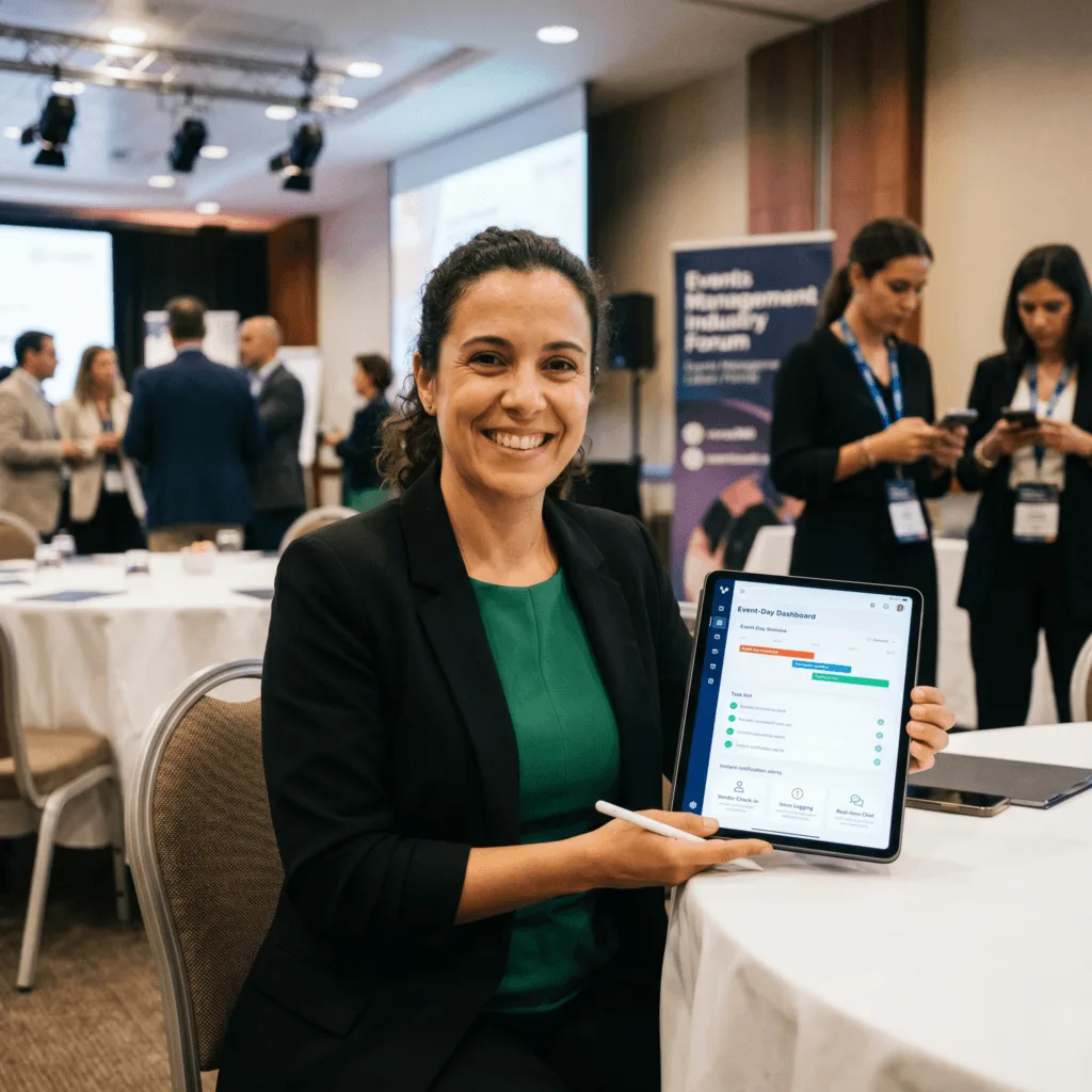
The Challenge: Sofia ran an events management company whose client portal, used for event planning, vendor approvals, and real-time event-day management, was being accessed almost entirely on mobile by event-day staff and clients. The portal had been designed for desktop planning sessions, and on event days when mobile was the only practical device, staff were struggling with it and reverting to WhatsApp and phone calls to communicate, creating a disorganised paper trail.
The vorza360 Solution: We rebuilt the event-day management functions of the portal using Mobile-First Design principles, prioritising the tasks most critical on event day: vendor check-in, timeline management, issue logging, and client communication. We designed a simplified event-day mobile mode that presented only the most time-critical functions from a cleaner interface, with the full desktop feature set available for pre-event planning. We built push notification capability for urgent communications.
The Result: Event-day WhatsApp and informal communication volume dropped significantly as the mobile portal became the functional tool for real-time event management. Client satisfaction scores for event communication improved in the first quarter after the rebuild. One large corporate client renewed their annual events contract and specifically cited the improved event-day communication and documentation as a reason, the mobile-first portal had created a professional paper trail that the WhatsApp approach had not.
Kwabena Asante (Ghana)
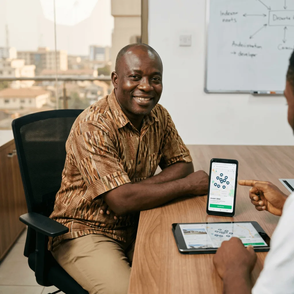
The Challenge: Kwabena ran a property listing platform operating in Accra. Over 85% of his users were accessing the platform on mobile phones, but the listing search, filter, and map view functionality had all been designed for desktop use. Mobile users were unable to use the map search effectively, the filter system required precise interactions that mobile touchscreens couldn’t support reliably, and the listing page typography was too small to read comfortably on a 5-inch screen.
The vorza360 Solution: We rebuilt the property search experience from the ground up using Mobile-First Design principles. The map search was redesigned with a full-screen mobile-native experience with cluster markers that expanded on tap. The filter system was replaced with a bottom-sheet interface that the user could swipe up from any search result page. All listing pages were redesigned with mobile typography hierarchy that prioritised the key decision information, price, size, location, in the immediately visible area.
The Result: Mobile search session duration increased by 120% as the improved experience encouraged deeper exploration rather than quick abandonment. Enquiry submission rate from mobile improved from 1.4% to 5.8%. Kwabena described the most significant change as the map search adoption, previously unused by mobile visitors, it became the primary search method for 58% of mobile users after the redesign, suggesting that the feature had always been what mobile users wanted and the previous implementation had simply made it impossible to use.
Why Mobile-First Matters
Mobile-first design means we start the design process by planning the layout and features for the smallest screen (a mobile phone) first. Only after that is perfect do we adapt the design for larger screens like tablets and desktops.
This approach ensures that your website loads fast, has only the most important content, and is extremely easy to use on a phone. Since search engines like Google look at the mobile version of your site first, this is the most effective mobile first design strategy for the best search engine rankings.
How we do it
We follow a strategic process to create the mobile first website designs that prioritize speed and clarity for mobile users.
Plan Small Content
We start by deciding on the most important information and features for the phone screen. This ensures a clean interface and fast loading times for our custom mobile-first interface design.
Design for Touch
We design all buttons, menus, and forms to be easily tapped with a finger on a small screen. We ensure the navigation is simple and clear for effortless user experience.
Scale Up the Layout
After the mobile design is approved, we add more elements and reorganize the space for tablets and desktop screens. We build the mobile first responsive design smoothly across all devices.
Plan Small Content
We start by deciding on the most important information and features for the phone screen. This ensures a clean interface and fast loading times for our custom mobile-first interface design.
Design for Touch
We design all buttons, menus, and forms to be easily tapped with a finger on a small screen. We ensure the navigation is simple and clear for effortless user experience.
Scale Up the Layout
After the mobile design is approved, we add more elements and reorganize the space for tablets and desktop screens. We build the mobile first responsive design smoothly across all devices.
Here is what our Clients are saying About us
Erik Lindberg (Sweden)
vorza360 designed our website with mobile as the primary design surface, not an afterthought. Our mobile experience is genuinely better than our desktop one, the right priority given that over 70% of our traffic is mobile.
Ahmad Al-Mutairi (UAE)
vorza360 redesigned our e-commerce website with a mobile-first approach that has dramatically improved our mobile conversion rate. Mobile-first design that treats mobile users as first-class citizens rather than desktop users with smaller screens.
Radu Ionescu (Romania)
vorza360 designed our web application with mobile-first principles that have made it genuinely usable on smartphones. Our field team uses the application on their phones daily, something that was not practical with our previous desktop-first design.
Priya Krishnan (India)
vorza360 designed our service booking website with mobile-first design for our audience who overwhelmingly book on mobile. Conversion on mobile improved significantly after the mobile-first redesign replaced our responsive desktop design.
Nattaporn Charoenwong (Thailand)
vorza360 applied mobile-first design principles to our content website, resulting in faster load times and better readability on mobile. Our mobile session duration increased after the redesign, visitors stay and read rather than bouncing.
Emmanuel Okonkwo (Nigeria)
vorza360 designed our website mobile-first because that is how our entire audience accesses the web. A website designed for our users’ actual behaviour rather than adapted from a desktop-first design that does not fit.
More about Website Design
Custom Website Design
vorza360 offers specialized custom website design solutions to create a unique…
Got questions? We’ve got answers. Find everything you need to know about using our platform, plans, and features
What is Mobile-First Design and why is it the recommended approach in 2025 and beyond?
Mobile-First Design is an approach where the website is designed and built for the smallest screen, a smartphone, first, and then progressively enhanced for larger screens like tablets and desktops. This is the recommended strategy because the majority of global web traffic now comes from mobile devices, and Google uses Mobile-First Indexing, meaning it ranks websites primarily based on their mobile experience, not their desktop version. vorza360 applies a Mobile-First Design strategy on all new website projects, ensuring the fastest possible performance and the cleanest possible user experience on the devices most of your visitors are actually using.
How does Mobile-First Design differ from simply making a desktop website work on mobile?
Making a desktop website work on mobile, called graceful degradation, typically involves squeezing a design built for a large screen down to fit a small one, often resulting in small text, cluttered layouts, slow load times, and awkward navigation. Mobile-First Design takes the opposite approach, starting with a clean, fast, touch-optimized design for the smallest screen and then adding content and layout complexity as the screen size increases. This produces a significantly better mobile experience because the design is native to the device rather than adapted from something built for a different context.
How does vorza360 optimize website performance specifically for mobile users?
Mobile performance optimization involves multiple layers of technical work. We use a Plan Small Content approach, ensuring only the most essential content and features are included in the mobile experience, keeping pages lean and fast. We optimize all images for mobile screens using modern formats like WebP that load faster without quality loss. We ensure all interactive elements, buttons, menus, forms, are Touch-Friendly with appropriately sized tap targets that are easy to use with a finger. We defer non-critical scripts and CSS, leverage browser caching, and test real loading speeds on actual mobile network conditions before launch.
Does a Mobile-First Design approach affect how our website looks on desktop?
No, a well-executed Mobile-First Design produces an excellent experience on every screen size. After designing and approving the mobile layout, we Scale Up the Layout for tablets and desktops, adding additional content, wider image treatments, multi-column arrangements, and richer visual elements that take advantage of the larger screen real estate. The result is a design that feels specifically crafted for each device type, not a compromise between them. Desktop visitors see a full, rich website experience; mobile visitors see a fast, clean, touch-optimized version, both reflecting the same consistent brand identity.
How does vorza360 test Mobile-First Design across different devices and screen sizes?
We conduct rigorous real-device testing as a standard part of every mobile-first project. In addition to browser-based emulation tools, we test on actual physical devices spanning a range of screen sizes, operating systems, and performance levels, from high-end flagship phones to mid-range Android devices that are more representative of the global average user. We test every interactive element for touch usability, every form for ease of input on a mobile keyboard, and every page for load speed on 4G and lower network conditions. We also validate the final site against Google’s Mobile Usability report and Core Web Vitals to confirm it meets the standards that Google uses for search ranking.