Speed up your workflow with the best Figma components library. We build organized Figma component libraries that ensure consistency across your entire project.
The Challenge Kristaps had a growing team, but their design process was disorganized. They were recreating the same elements over and over, which led to a messy workspace and inconsistent designs that confused their junior team members.
The vorza360 Solution We implemented an Atomic Design System. We started with the smallest “atoms” (like colors and fonts) and combined them into “organisms” (like headers and forms). This created a logically structured Figma website component library that is perfectly documented.
The Result Designing now feels like building with Lego. The library is a lifesaver for his team, providing a clear, organized foundation that makes scaling his digital products easy and fun.
Fiona MacMillan (UK)
The Challenge: Fiona’s team was overwhelmed by “clutter.” Every time they needed a button, they had to hunt through hundreds of individual files to find the right version (like a “hover” state or a “disabled” state).
The vorza360 Solution We created an advanced variant setup. Instead of hundreds of files, we built single assets with simple “toggles.” Designers can now change a button’s state or color with one click right inside the properties panel.
The Result Workspace clutter has been drastically reduced. Her team can now build high-fidelity screens in a fraction of the time, focusing on creativity rather than searching for files.
Ville Niinistö (Finland)
The Challenge Ville’s team was wasting hours every week manually resizing boxes, cards, and forms to see how they would look on mobile versus desktop. If they changed a word, the whole layout would break.
The vorza360 Solution We used responsive component engineering. Every item in the library uses “Fill Container” and “Auto Layout” settings. This means the components automatically stretch or shrink to fit any screen resolution perfectly without breaking the design.
The Result: The team has stopped doing repetitive manual work. They now have a “world-class” library that handles different devices automatically, allowing them to launch products faster across all platforms.
Amina Al-Masri (Jordan)
The Challenge Amina wanted her SaaS platform to support both Light and Dark modes to match her users’ preferences. She needed a way for designers to switch between these looks instantly without redesigning every single page.
The vorza360 Solution We built a library with multi-theme support. By mapping colors to “design tokens,” we made it so a single click can flip the entire design from light to dark. This same logic was passed to the developers for an effortless build.
The Result: The platform is technically sophisticated and user-friendly. Amina can now offer a customized experience to her users while keeping the design process incredibly efficient for her team.
Sanjay Patel (India)
The Challenge Sanjay’s design files were a mess of detached instances meaning the links between the master designs and the actual pages were broken. This led to errors and a lot of “bloat” that slowed down the software.
The vorza360 Solution We performed a full library audit and cleanup. We ran “Design Lints” (technical checks) to find errors and updated every element to use the latest, fastest Figma features. We now provide a maintenance service to keep the files accurate.
The Result: The source of truth is now solid. The developer handoff is error-free because the design files are clean, lightweight, and perfectly synchronized with the master components.
Lukas Weber (Luxembourg)
The Challenge Lukas needed his designs to be “production-ready.” He didn’t just want pretty pictures; he needed a system where the names of the design elements matched the names his developers used in their code (like Tailwind or Storybook).
The vorza360 Solution: We built pixel-perfect, mathematically precise systems. Every component in our Figma library is named to match the code exactly. This creates a “framework-ready” workflow that makes the handoff to engineering a breeze.
The Result: The transition from design to live code is faster than ever. Lukas has a high-performance system that bridges the gap between the creative team and the technical team perfectly.
vorza360’s Tech Edge
Reusable Components
Variants & Properties
Auto Layout Constraints
+ 2
More
Nested Components
Shared Libraries
vorza360’s Tech Edge
Reusable Components
We build master elements that you can use hundreds of times while only editing once.
Variants & Properties
Our team groups similar items (like buttons) into a single Figma component library for easy switching.
Auto Layout Constraints
We ensure your Figma website component library scales perfectly when you change text or screen sizes.
Nested Components
We place smaller units inside larger ones to create complex component libraries Figma that are easy to manage.
Shared Libraries
We publish your assets so your whole team can access the best Figma component library from any file.
Atomic Design System Building
We create a component library in Figma starting from the smallest parts like icons and labels.
Advantages
We build "Atoms" like colors and fonts to set your brand's foundation.
Our team combines these into "Molecules" like search bars or form inputs.
We scale these up into "Organisms" to build full sections for your Figma components library.
This structured approach ensures your Figma website component library is logic-based.
We document every rule so your team knows exactly how to use each element.
Advanced Variant Setup
We simplify your Figma library components by nesting multiple states into one single asset.
Advantages
We create "Hover," "Pressed," and "Disabled" states for every interactive button.
Our team uses "Boolean" properties to toggle icons or labels on and off instantly.
We set up "Size" variants so you can switch between Mobile and Desktop styles in one click.
This reduces clutter in your Figma component libraries and makes them faster to use.
This makes ours the best Figma components library for high-speed design work.
Responsive Component Engineering
Every item in our component library Figma is built to grow or shrink without breaking.
Advantages
We use "Fill Container" and "Hug Contents" settings so your cards adapt to long text.
Our team sets up grids within the Figma website component library for perfect alignment.
We test every Figma component library asset on multiple screen resolutions.
This ensures your component libraries Figma work for both web and mobile apps.
We eliminate manual resizing, saving your designers hours of repetitive work.
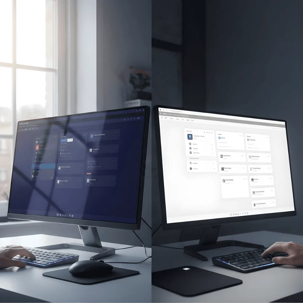
Multi-Theme (Dark/Light) Support
We use “Variables” to build a Figma components library that switches themes instantly.
Advantages
We map colors to "Tokens" so you can toggle between Light and Dark modes in seconds.
Our team ensures high contrast for better readability in every Figma component library.
This is essential for a modern web app UI design that needs to support user preferences.
We organize your Figma library components by theme for easy developer handoff.
This makes your component library in Figma future-proof and highly professional.
Library Audit & Maintenance
We keep your Figma component libraries clean and up-to-date as your product evolves.
Advantages
We remove "detached" or unused instances to keep your Figma components library fast.
Our team updates old assets to use the latest best Figma components library features.
We run "Design Lints" to catch inconsistent colors or fonts in your component library Figma.
We provide monthly updates to ensure your Figma website component library stays modern.
This keeps your "Source of Truth" accurate and reliable for both designers and devs.
Atomic Design System Building
We create a component library in Figma starting from the smallest parts like icons and labels.
ADVANTAGES
We build "Atoms" like colors and fonts to set your brand's foundation.
Our team combines these into "Molecules" like search bars or form inputs.
We scale these up into "Organisms" to build full sections for your Figma components library.
This structured approach ensures your Figma website component library is logic-based.
We document every rule so your team knows exactly how to use each element.
Advanced Variant Setup
We simplify your Figma library components by nesting multiple states into one single asset.
ADVANTAGES
We create "Hover," "Pressed," and "Disabled" states for every interactive button.
Our team uses "Boolean" properties to toggle icons or labels on and off instantly.
This reduces clutter in your Figma component libraries and makes them faster to use.
We set up "Size" variants so you can switch between Mobile and Desktop styles in one click.
This makes ours the best Figma components library for high-speed design work.
Responsive Component Engineering
Every item in our component library Figma is built to grow or shrink without breaking.
ADVANTAGES
We use "Fill Container" and "Hug Contents" settings so your cards adapt to long text.
Our team sets up grids within the Figma website component library for perfect alignment.
We test every Figma component library asset on multiple screen resolutions.
This ensures your component libraries Figma work for both web and mobile apps.
We eliminate manual resizing, saving your designers hours of repetitive work.
Multi-Theme (Dark/Light) Support
We use “Variables” to build a Figma components library that switches themes instantly.
ADVANTAGES
We map colors to "Tokens" so you can toggle between Light and Dark modes in seconds.
Our team ensures high contrast for better readability in every Figma component library.
This is essential for a modern web app UI design that needs to support user preferences.
We organize your Figma library components by theme for easy developer handoff.
This makes your component library in Figma future-proof and highly professional.
Library Audit & Maintenance
We keep your Figma component libraries clean and up-to-date as your product evolves.
ADVANTAGES
We remove "detached" or unused instances to keep your Figma components library fast.
Our team updates old assets to use the latest best Figma components library features.
We run "Design Lints" to catch inconsistent colors or fonts in your component library Figma.
We provide monthly updates to ensure your Figma website component library stays modern.
This keeps your "Source of Truth" accurate and reliable for both designers and devs.
Why Choose vorza360 for This Service?
vorza360 builds the best Figma component library to help your team design 10x faster.
Developer Ready
We name our Figma library components to match your code, making handoff a breeze.
Pixel Perfect
Every asset in our component library in Figma is built with mathematical precision.
Zero Bloat
We focus on “light” Figma component libraries that don’t slow down your computer or your workflow.
Tools
Framework-Ready Tools & Plugins
Storybook Connect
We link your Figma components library directly to your code documentation.
MUI/Tailwind Kits
We align your Figma website component library with your chosen CSS framework.
Anima
A tool we use to turn component library Figma assets into high-quality React or HTML code.
Tokens Studio
We manage “Design Tokens” across your Figma component libraries for complex, multi-platform projects.
Here is what our Clients are saying About us
Erik Lindberg (Sweden)
vorza360 built a Figma component library for our design system with every component documented, all variants covered, and auto-layout used throughout. Our designers compose screens from the library rather than rebuilding components for every new screen.
Noura Al-Ali (UAE)
vorza360 created a Figma component library for our brand with components that enforce our design standards automatically. Design consistency across our product family that scales as our product grows.
Silviu Florescu (Romania)
vorza360 built a comprehensive Figma component library for our web platform covering all our UI patterns. New feature design that previously took days now takes hours because the building blocks exist.
Vikram Kapoor (India)
vorza360 built a Figma component library aligned to our React component library so designers and developers work from the same system. Design-code parity that has improved our implementation accuracy.
Charlotte Nielsen (Denmark)
vorza360 created a Figma component library for our design team with interactive states, accessibility annotations, and usage guidelines embedded in each component. A library our team uses because it genuinely helps them.
Fatima Al-Sayed (Nigeria)
vorza360 built a Figma component library for our product that our small design team uses to maintain consistency without a dedicated design system team. Scalable design consistency for our organisation size.
More about Figma
UI/UX Design in Figma
Create stunning digital experiences with our ui ux design in Figma services, focusing on…
Got questions? We’ve got answers. Find everything you need to know about using our platform, plans, and features
What is a Figma Component library, and why is it useful?
At vorza360, we define a Figma Component library as a centralized collection of unique and reusable digital elements, such as buttons, input fields, cards, and navigation bars, that serve as the foundational building blocks of your interface. We build these libraries using specialized Figma design services to ensure absolute visual consistency across every page of your project. By having a pre-defined set of elements, we can design new features much faster and ensure that your digital presence remains organized and easy to maintain as your business evolves.
How do component libraries improve my Figma technology?
Component libraries significantly improve your Figma technology stack by introducing a “modular” approach to design. They enhance efficiency through a system called “atomic design,” which allows us to update a single “master” component and have that change reflect instantly across every single instance in your entire project. This automated synchronization streamlines the design process, eliminates manual errors, and ensures your design files remain high-performing and scalable, even as the complexity of your website or app increases.
Can these components be reused for future projects?
Yes, one of the greatest values of our service is that we build unique and reusable components designed to serve as long-term assets for your business growth. These “master components” are not just for your current project; they are built to be part of your brand’s permanent digital toolkit. This ensures your brand identity remains consistent even as you add entirely new sections, launch sub-brands, or expand into new digital platforms over time, saving you from having to reinvest in foundational design work in the future.
Do you sell pre-made component kits or icons?
No, vorza360 is a dedicated service provider, and we do not sell generic, pre-made component kits, icon packs, or digital products. We believe that a “one-size-fits-all” kit often fails to capture a brand’s true personality. Instead, we provide the professional service of creating custom libraries tailored specifically to your brand’s unique identity and functional requirements. We deliver bespoke digital solutions that are crafted for your specific audience, rather than selling static products that may not align with your business goals.
How does a component library benefit the development team?
A component library acts as a bridge between design and code, creating a highly organized system that your development team can follow with precision. When our designers and your developers use the same library of components as a reference, the coding process becomes much more efficient and far less prone to mistakes. This “source of truth” allows developers to build reusable code blocks that match the Figma components exactly, resulting in a faster build time, cleaner code, and a final product that functions as flawlessly as it looks.